
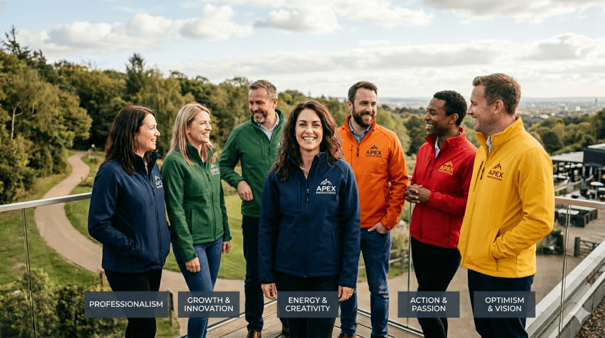
What Your Jacket Colour Says About Your Team or Brand
Colour is one of the most powerful tools in visual identity — and in group jackets, it communicates something before anyone reads a single word of your design. The colour you choose for your team or brand jacket sends a signal. Here's what the most popular choices communicate, and how to think about your selection.
Black: Authority, Sophistication, Confidence
Black is the most versatile and perennially popular jacket colour. It communicates professionalism, confidence, and a premium feel. In streetwear, it reads as cool and restrained. In corporate settings, it reads as polished and serious. It's also the most practical choice if your team needs to wear the jacket in formal and informal settings alike.
The risk with black: it can look generic without strong design work. If you're going black, your embroidery, patches, and design details need to do the heavy lifting.
Navy: Heritage, Trust, Tradition
Navy is the classic collegiate colour and communicates trust, reliability, and a certain understated credibility. It's not trying too hard — it just looks established. Navy is a natural choice for schools, rowing clubs, swimming teams, and any organisation that values a sense of tradition.
Navy also pairs beautifully with white, gold, or red — giving you strong secondary colour options for your design.
Maroon and Burgundy: Warmth, Premium, Distinction
Maroon and burgundy communicate a sense of warmth, richness, and distinction. It's a colour that reads as premium without the coldness of black or the conservatism of navy. It's become increasingly popular for university sports teams, rugby clubs, and anyone who wants to stand out from the sea of navy and black while still looking serious.
Red: Energy, Urgency, Passion
Red is a bold statement. It communicates energy, passion, and intensity — which is why it's dominant in high-energy sports like football and basketball. For brands, red signals confidence and assertiveness. It's hard to ignore in a crowd, which makes it excellent for teams that want to be seen.
Red needs to be used thoughtfully. With the wrong secondary colours, it can read as aggressive or chaotic rather than powerful.
Green: Growth, Nature, Originality
Forest green has had a significant resurgence in popularity. It communicates a sense of groundedness, originality, and connection to nature — which is why it's popular with outdoor sports, environmental brands, and teams that want something distinctive without being jarring. Green paired with cream or gold creates a particularly premium, considered look.
White and Cream: Clean, Minimal, Premium
White or cream jacket bodies communicate cleanliness, minimalism, and a quietly premium aesthetic. They're harder to maintain than darker colours, which means wearing one signals that you take care of things — a subtle message that works well for aspirational brands and prestige garments like graduation jackets.
Choosing Your Colour
The right colour for your team is the one that honestly reflects who you are — not just what looks good in isolation. Think about how the jacket will be worn, where it will be seen, and what you want the people wearing it to feel.